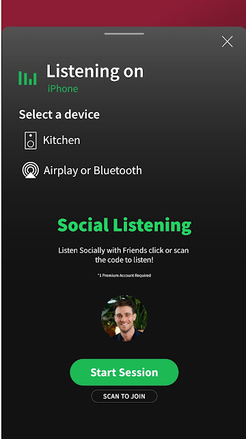


After multiple different designs, these are the mobile designs I like the most, I feel that it fits the brief perfectly, adding a new feature which allows users to use social media to interact with each other while listening to music. This social listening feature, fits in nicely with the brief, it now allows users to interact with each other, via social media, while listening to music. The overall design is clean, and follows Spotify's user-interface, which allows the overall design look extremely similar to the design currently, which is what I was aiming for, the overall design works for Spotify, however adding this new feature means that some of the buttons have had to be moved, to allow room for the social listening feature. I have kept the simplicity within the design, such as keeping certain pages looking the same, such as the currently listening page, the only difference it has is at the bottom of the screen, there is now a swiping up feature which allows the user to see everyone else who is listening with you. The social listening playlist has kept the same design as what a normal playlist currently looks.
Desktop App
This is the new redesigned desktop app, which has the new added feature of social listening. I have kept the overall design relatively similar to the preexisting app, however there are some major changes, such as the search bar has now been moved to the left, and it is always there, to make searching for music easier than ever. There is now a tab at the bottom of the screen, which mirrors the mobile app, this feature is completely new, compared to the preexisting app. This has allowed the new feature to be easily added in, without changing to much of the overall design. The other major change is the homepage, which not only mirrors the mobile app, but also has become part of the discover bar as well, the further down you scroll on this page, the more discovery in the type of music there will be. Again this design has kept to Spotify's preexisting UI. Which means users will still be able to find their way around the app.


Comments
Post a Comment