UI Design
User interface designers work closely with user experience designers and other design specialists. Their job is to make sure that every page and every step of the user will experience in their interaction with the finish product will conform to the overall vision created by UX designers.
UX Design
User experience is a persons emotions and attitudes about using a particular product, system or service. Includes the practical, experiential, affective, meaningful and valuable aspects of human-computer interaction and products ownership.
Meet the users needs.
To improve a users experience with your product or service you need to learn what they are looking for in a design, This is done through user testing and other methods.
Be consistent
Uses expect products to share some similarities with other products we regularly use this makes it easy for them to become familiar with the new product without any additional learning costs. The more familiar your design is to be uses the faster they can learn to use it which enhances their experience.
Usability
Your ex design is entirely focused on solving the use of problems, which makes usability of the design one of the most crucial user experience design principles. The website shouldn't be cluttered because that is bound to lose visitors, the design needs to be quick and easy to find what information you are looking for.
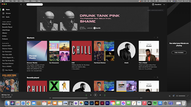
Spotify's Dark Interface
Dark mode is more a recent trend in interface design, allowing users to choose or toggle between light and dark interfaces in various applications yet Spotify has maintained a dark interface since it’s inception. Not only does this differentiate itself from Apple Music, but studies have shown that darker backgrounds with lighter text are easier on the user’s eyes. Even if it’s not even perceivable to the user, this level of visual comfort is a contributing factor to incentivising continued browsing on the application. Additionally, this makes images, buttons, and featured content stand out, making it easier to follow user flows. This dark interface is also continued over all formats, such as an app on your phone it still follows mostly the same design choices, however the app on our phones do look completely different, this was done to allow ease of navigation on a smaller screen.
Curved EdgesSimilar to a dark interface, fully rounded buttons or “pill” buttons are not objectively better in all cases but have properties that can be more eye-catching and distinctive for the user. The trick is to design the right button for the right context. With rounded corners, however, the button needs to be bigger but Spotify can afford to do so because it already preserves a great deal of whitespace throughout the rest of the interface.

Visual Hierarchy
By using size, colour, positioning, and alignment of various elements, Spotify promotes a good visual hierarchy that communicates what the users should be paying attention to first. By doing this, users can quickly digest and orient themselves within the app experience. When searching for something, on Spotify, the artists are show in circles and albums and playlists are in squares, the most related items to the search will be shown at the top and will be the largest. For example, when I searched for 'Khalid' the top result was obviously the artist. Then, Spotify showed me radios and playlists related to my search, and then further down the page, it showed me related songs and playlists in which he appears on too.
Conclusion
Spotify does a lot of simple things right with its UX/UI and much of it may seem obvious. However, visual hierarchy, good contrast, and quality buttons isn’t a recipe that you can use in any environment. The challenge for designers is to contextualise these principles in a way that seems intuitive and natural to the user.


Excellent research and reflection of the UI on spotify. Good to see that you have considered both browser and mobile.
ReplyDeleteFound this, may be of use to you:
ReplyDeletehttps://uxdesign.cc/have-you-spotify-recently-2b720b674f63